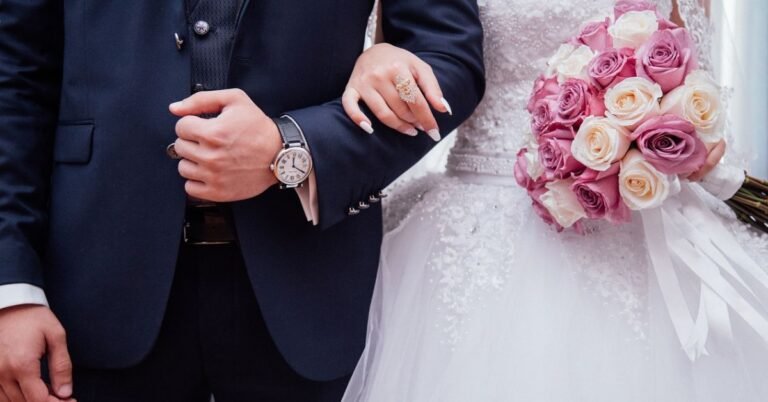
3 Wedding Color Palettes That Never Go Out of Style (Plus How to Actually Use Them!)
Picking your wedding colors can feel overwhelming. You’re scrolling through Pinterest at 2 AM, seeing a million gorgeous combinations, and suddenly you’re questioning everything. Sage green or dusty blue? Rose gold or champagne? Will your photos look dated in five years?
Take a deep breath. We’ve got you covered.
Today we’re breaking down three timeless color palettes that’ll look just as stunning in your 10-year anniversary photos as they do on your big day. Plus, we’ll show you exactly how to use these colors in your decor, outfits, and those pretty invitations everyone’s gonna keep on their fridge.
And hey, before your brain explodes from all the planning – check out our free wedding budget calculator and wedding timeline generator to keep everything organized. Because picking colors is fun; stressing about money and schedules? Not so much.
Moodboard Basics 101 (No Art Degree Required!)
Okay, so you’ve seen those gorgeous wedding moodboards on Instagram and wondered how designers make it look so cohesive. Here’s the secret formula they use:
The Three-Part Color System
1. Your Hero Color (50-60% of your palette) This is your main character. It’s the color people will remember from your wedding. Think of it as the base of your outfit – it should do most of the heavy lifting.
2. Your Accent Color (30-40%) This is the sidekick that makes your hero color pop. It adds depth and keeps things interesting. Like adding a leather jacket to your favorite dress – it just works.
3. Your Metal (10%) Gold, rose gold, silver, copper, or even black metals. This is the jewelry of your color palette. It ties everything together and adds that “fancy wedding” vibe.
Pro tip: Stick to this formula and you literally can’t mess it up. Your florist, decorator, and stationery designer will also love you for having a clear vision.
The 3 Timeless Palettes for 2025 (That’ll Still Look Good in 2035)
Palette #1: Soft & Dreamy (The Pastel Lovers)
The Vibe: Think garden party meets modern romance. This palette screams elegant without trying too hard.
- Hero Color: Blush pink or dusty lavender
- Accent Color: Cream or soft champagne
- Metal: Rose gold or champagne gold
Why it works: Pastels photograph like a DREAM. Seriously, your photographer will thank you. They’re soft enough to be romantic but not so baby-like that they feel childish. Plus, they look gorgeous in any season – summer garden wedding? Check. Winter ballroom? Also check.
Who it’s for: If you describe your style as “romantic,” “soft,” or “whimsical,” this is your palette. Also perfect if you’re having an outdoor or garden ceremony.
Palette #2: Natural & Organic (The Earthy Crew)
The Vibe: Bohemian elegance. Like if you had your wedding in a fancy forest or a chic vineyard.
- Hero Color: Terracotta or warm rust
- Accent Color: Sage green or olive
- Metal: Antique gold or brushed brass
Why it works: Earth tones are having a MAJOR moment and honestly, they deserve it. These colors are grounding, sophisticated, and work beautifully with natural elements like wood, greenery, and stone. Plus, they’re gender-neutral if you’re trying to avoid super “girly” vibes.
Who it’s for: Couples who love the outdoors, want a laid-back but elevated feel, or are planning a barn, vineyard, or desert wedding.
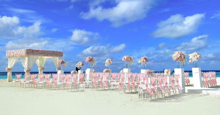
Palette #3: Bold & Luxe (The Glam Squad)
The Vibe: Old Hollywood meets modern luxury. We’re talking drama and sophistication.
- Hero Color: Emerald green or navy blue
- Accent Color: Ivory or crisp white
- Metal: Gold (the real deal, not rose gold)
Why it works: Deep, rich colors = instant elegance. They make everything look more expensive (even if you’re working with a tight budget – speaking of which, have you tried our wedding budget calculator yet?). These colors photograph incredibly well in evening lighting and work perfectly for formal or semi-formal weddings.
Who it’s for: If “classic elegance” and “timeless sophistication” are your jam. Perfect for hotel ballrooms, historic venues, or evening celebrations.
How Your Colors Affect Everything (Yes, EVERYTHING)
Now that you’ve picked your palette, let’s talk about how these colors show up in real life. Because it’s not just about the bridesmaid dresses – your colors touch literally every part of your wedding.
Your Decor & Florals
Your color palette is basically your decorator’s bible.
Flowers: Tell your florist your three colors, and they’ll create arrangements that flow perfectly. For example, if you’re doing the earthy palette, think roses in terracotta tones, eucalyptus for that sage green, and pampas grass as a neutral.
Linens: Your tablecloths and napkins are a huge chunk of your color story. Pro tip: neutral linens (cream, white, grey) let your accent colors shine without overwhelming the space.
Candles & Small Details: This is where your accent color comes in. Colored candles, ribbons on programs, even the color of your guest book – all opportunities to sprinkle in those accent shades.
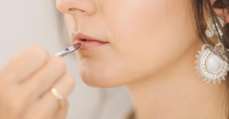
Your Attire (Not Just the Dress!)
Bridesmaid Dresses: Usually your hero or accent color. But here’s a trend we’re loving – mixing shades! If your palette is pastel, have bridesmaids in different shades of blush, champagne, and soft lavender.
Groomsmen: Ties, pocket squares, socks (yes, socks!) are perfect places for your accent color. Navy suit with a dusty lavender tie? Chef’s kiss.
Your Outfit: Whether you’re wearing white, ivory, or something completely different, your colors show up in your bouquet, shoes, accessories, and even your partner’s boutonniere.
Your Printables & Paper Goods
This is where your color palette makes its FIRST impression.
Save the Dates & Invitations: These set the tone. Use your colors strategically – hero color for borders or backgrounds, accent color for text or details, and your metal in any foil stamping or envelope liners.
Day-Of Paper: Programs, menus, place cards, table numbers – all opportunities to reinforce your palette. Pro tip: Keep it simple. Use your hero color as the main color and accent colors for borders or small details.
Signage: Welcome signs, seating charts, cocktail hour signs – these are decor pieces! Incorporate your colors so everything feels cohesive.
Sample Tablescape Breakdown (Let’s Get Specific!)
Let’s take Palette #2 (Earthy) and design an actual table so you can see how this all comes together.
The Earthy Elegance Table
Table Linen: Natural linen in oatmeal or tan (neutral base that lets other colors pop)
Napkins: Terracotta cloth napkins with a sage green ribbon tied around them
Plates: White or cream dinner plates (keeps it classic and not too matchy-matchy)
Centerpiece:
- Low wooden boxes or terra cotta pots as bases
- Florals: rust-colored roses, white ranunculus, and lots of olive and eucalyptus greenery
- Incorporate dried elements like pampas grass or bunny tails for texture
Candles: Pillar candles in various heights – mix cream candles with terracotta ones
Place Cards: Cream cardstock with guest names written in a warm brown ink, placed on small olive branches
Flatware: Antique gold or brass (brings in that metal!)
Glassware: Simple clear glasses or amber-tinted goblets
Special Touch: Scatter raw wooden elements (slices, small branches) around the centerpiece for that organic feel
See how it works? Every color in your palette shows up multiple times but in different ways. It’s cohesive without being boring, and it’s got layers (literally) that make it interesting to look at.
Making Your Palette Work for YOUR Budget
Here’s something nobody tells you: expensive weddings and “cheap” weddings can use the SAME color palettes. It’s all about where you invest.
Working with a tight budget?
- Focus your colors in high-impact areas: ceremony backdrop, head table, and bridal party attire
- Use your accent color sparingly – a little goes a long way
- Greenery is your best friend (and it’s usually cheaper than flowers)
- DIY your paper goods using your color palette (Canva is free and amazing!)
Got more to spend?
- Go ALL IN on florals in your palette
- Upgrade your linens to specialty colors
- Add colored uplighting that matches your hero color
- Custom everything – from cocktails in your colors to monogrammed napkins
Not sure what you can afford? Our wedding budget calculator breaks down costs by category so you know exactly where to splurge and where to save.
Common Color Palette Mistakes (And How to Avoid Them)
Mistake #1: Too Many Colors Look, we love a rainbow as much as the next person, but more than three colors (plus your metal) gets messy fast. Stick to your trio and you’re golden.
Mistake #2: Forgetting About Lighting Your colors will look different in natural daylight vs. evening uplighting. Ask your venue about their lighting and maybe visit at the same time of day as your wedding.
Mistake #3: Not Considering Your Venue If you’re getting married in a space with strong existing colors (like a barn with red walls or a ballroom with blue carpet), make sure your palette complements rather than fights with it.
Mistake #4: Ignoring the Season Technically any palette works any time, but deep jewel tones feel more natural in fall/winter while pastels sing in spring/summer. Not a rule, just something to think about.
Mistake #5: Being TOO Matchy-Matchy Different shades and tones of your colors create depth. Don’t stress if your bridesmaid dresses don’t EXACTLY match your napkins. In fact, slight variations look more organic and expensive.
Actually Communicating Your Vision
You’ve picked your perfect palette – congrats! Now you need to communicate it to like, 10 different vendors. Here’s how:
Create a Simple Moodboard You don’t need fancy software. Use Pinterest to create a private board with:
- Your three colors shown clearly
- Example photos of weddings with similar vibes
- Specific items you love (a table setup, a bouquet, an invitation style)
Get Physical Samples Hit up a craft store and get paint swatches, fabric samples, or ribbon in your exact colors. Give these to your florist and decorator. Way easier than saying “sage green” when there are 47 shades of sage.
Use Descriptive Words Instead of just “pink,” say “dusty rose” or “blush with peachy undertones.” The more specific, the better.
Share Your Timeline Speaking of which, have you set up your wedding timeline yet? Knowing when you need to book vendors helps ensure everyone’s on the same color-page from the start.
Bringing It All Together
Here’s the truth: the “perfect” color palette is the one that feels like YOU as a couple.
Does the idea of earthy terracotta make your heart happy? Do you dream about blushing pastels? Or do you feel most yourself in bold, dramatic jewel tones?
Go with your gut. These three palettes are timeless because they’re based on colors that exist in nature and have been used in design for centuries. You literally cannot go wrong.
And remember – your wedding colors are just one piece of the puzzle. You’ve also got to think about budgets, timelines, vendor bookings, and about a million other details. That’s why we created free tools to make your life easier:
- Wedding Budget Calculator – Know exactly what you can spend in each category
- Wedding Timeline Generator – Create a realistic planning timeline so nothing falls through the cracks
Because at the end of the day, your wedding should feel joyful, not stressful. Pick colors you love, use our tools to stay organized, and focus on what really matters – celebrating your love with your favorite people.
Now go forth and create something beautiful! And hey, when you’re looking at your gorgeous wedding photos years from now, you’ll be so glad you went with a timeless palette that still makes your heart skip a beat.