How to Choose the Perfect Wedding Color Palette for Your Invitations
Your wedding invitations are the first glimpse your guests will have of your special day. The colors you choose set the tone for your wedding theme, reflecting the atmosphere, formality, and overall aesthetic. Selecting the perfect wedding color palette ensures that your invitations seamlessly match your décor, florals, and attire.
In this guide, we’ll help you navigate color psychology, seasonal trends, and design techniques to create the perfect color scheme for your wedding invitations.
1. The Importance of Choosing the Right Wedding Invitation Colors
Your wedding invitations should be more than just beautiful—they should evoke the mood and style of your event. Here’s why choosing the right colors matters:
- First Impressions Count: Your invitations provide a sneak peek into the theme and formality of your wedding.
- Cohesion with Wedding Theme: A well-chosen color palette ensures your invitations complement your overall wedding décor.
- Timeless or Trendy: Choosing timeless colors ensures classic elegance, while trendy hues can add a modern touch.
💡 Tip: If you’re unsure, opt for neutral tones with an accent color to keep your invitations elegant yet versatile.
2. Understanding Color Psychology in Wedding Invitations
Colors evoke emotions, so understanding color psychology can help you create the right mood for your wedding.
Popular Wedding Colors and Their Meanings:
- Romantic Colors: Blush pink, soft lavender, champagne – Symbolizing love, femininity, and romance.
- Elegant & Timeless Colors: Ivory, gold, navy, black – Classic choices that exude sophistication.
- Bold & Dramatic Colors: Emerald green, burgundy, deep blue – Perfect for making a statement.
- Natural & Earthy Tones: Sage, terracotta, taupe, beige – Best for rustic and outdoor weddings.
💡 Tip: Think about the mood you want to create—soft and romantic, bold and dramatic, or modern and sleek?
3. Trending Wedding Color Palettes for 2025
Classic Neutrals:
- Ivory
- Champagne
- Dusty Rose
Earthy & Bohemian:
- Rust
- Burnt Orange
- Sage Green
Modern Elegance:
- Black
- Gold
- White
Soft Pastels:
- Blush
- Lavender
- Baby Blue
Jewel Tones:
- Emerald
- Sapphire
- Deep Plum
💡 Tip: Use two main colors and one accent color for balance and visual appeal.
4. Choosing the Right Color Palette for Your Wedding Season
Each season has its signature color schemes that complement the natural backdrop and mood of the time of year.
4.1 Spring Wedding Color Palettes
- Soft pastels, floral-inspired tones
- Popular choices: Lavender, blush, mint green
4.2 Summer Wedding Color Palettes
- Vibrant and tropical hues
- Popular choices: Coral, peach, turquoise, sunflower yellow
4.3 Fall Wedding Color Palettes
- Warm, earthy tones
- Popular choices: Terracotta, burnt orange, mustard, deep reds
4.4 Winter Wedding Color Palettes
- Rich jewel tones and icy shades
- Popular choices: Navy, emerald green, burgundy, silver
💡 Tip: Your invitation colors should harmonize with your venue’s seasonal aesthetics.
5. How to Match Your Wedding Invitation Colors to Your Theme
Rustic Wedding Invitations:
- Earthy tones, kraft paper, warm hues.
Modern Wedding Invitations:
- Monochrome, metallics, minimalistic pastels.
Beach Wedding Invitations:
- Soft blues, seafoam green, sandy beige.
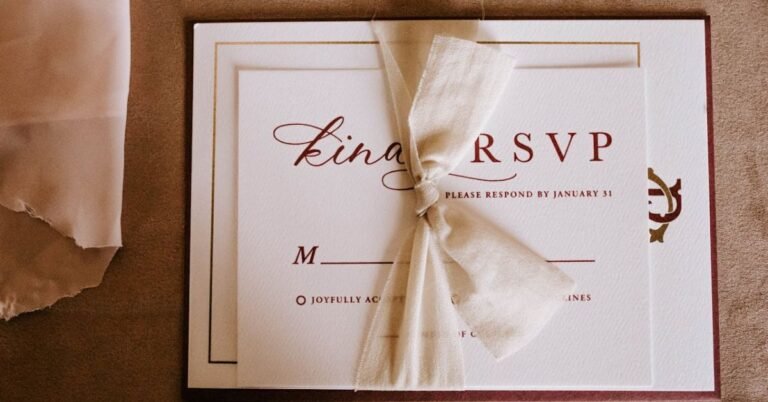
Vintage Wedding Invitations:
- Muted, romantic colors like dusty rose and antique gold.
💡 Tip: Incorporate textures and embellishments like deckled edges or wax seals for added charm.
6. Tips for Customizing Your Wedding Invitation Colors
Enhance Your Design with These Customization Ideas:
- Gradient or Watercolor Backgrounds: Adds depth and artistic flair.
- Metallic Foils: Elevate your invitation with gold, silver, or rose gold accents.
- Contrasting Envelope Liners: A surprise element that ties into your wedding colors.
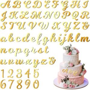
- Floral Illustrations: Incorporate subtle floral prints to enhance the color palette.
💡 Tip: When in doubt, request color swatches from your invitation designer to ensure the perfect match.
7. Common Mistakes to Avoid When Choosing Wedding Invitation Colors
❌ Picking colors that clash with your wedding décor. Ensure your invitations complement your overall aesthetic. ❌ Using too many colors. Stick to a 2-3 color palette for an elegant look. ❌ Not considering readability. Light text on light backgrounds or dark text on dark backgrounds reduces legibility. ❌ Ignoring printing limitations. Some colors don’t print well on all materials—check with your printer beforehand.
💡 Tip: Always proof your invitations in print before finalizing the order!
Conclusion
Your wedding invitation colors set the stage for your big day, helping to create a cohesive, stylish, and memorable wedding experience. Whether you choose bold jewel tones, soft pastels, or timeless neutrals, selecting the perfect palette will ensure your invitations reflect your unique vision.
🎨 Need inspiration? Download our free Wedding Color Palette Guide today!
📌 Explore our curated collection of wedding invitation templates designed to match any color scheme.